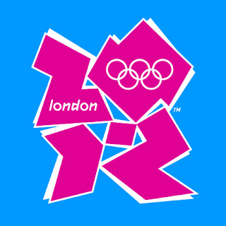
Image of the games
The awful logo for the 2012 London Olympics only seems to appear in the most garish of '90s pastel colour combinations just to emphasise the hideousness. Is this from the same British design school that gave us the Austin Allegro and the Reliant Robin? If you're going to be spending 20 billion quid or whatever on the games why not have forked out for a decent logo?
Why did they choose the worst one?
It's shit and it says nothing.
It's a broken, shattered mess - quite possibly a jumble of clip art circa 1992 - filled in by a colour blind person using a crappy Microsoft programme. It projects an uncomfortable, disjointed confusion - the last thing you want to do with the biggest show on Earth.
Guardian:
The London Games is looking ugly, and I mean that literally. It started early, with the unveiling of that painful logo, the colour scheme for which appears inspired by a Nike catalogue. It resembles either Lisa Simpson performing a sex act or a child's illustration of the breakup of Pangaea. Granted, a long look eventually yields an Easter egg – a "2012" hidden amid the horror – but, like an eclipse, it's hard to stare at it long enough to appreciate it. (Has the sun taught you nothing, London? Perhaps if you saw it more often.)


3 Comments:
I see, on the left, a woman in an Amish bonnet pouring out soup for a stooping homeless man with curly hair.
Tim . Your right ! It's fucking hideous .
@ Fern ... Hahaha ! Brilliant .
I see a leggo family after having gone through a combine harvester then their remains were run over by the steam roller the combine harvester was swerving to avoid . Just looking at it makes me pedantic and confused .
I bet lawyers and accountants just love it .
Hundertwasser once said " There is no God in straight lines "
And I'm not taking the piss .
http://www.urinal.net/hundertwasser/
Picked up by adReview too http://adreview.posterous.com/logo-london-2012-olympics
Post a Comment
<< Home